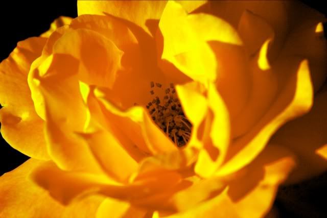
Yellow (?) rose of L.A.


Posted by fxmixer on Thu Oct 13, 2005 3:55 am

All times are UTC-05:00

Reply to topic  
 First unread post  | 6 posts | 
Image
This started as an orangey-red rose from my front rose bed. I wanted to alter the color and bring more emphasis to the detail inside. Selective color adjustments, selective sharpening, levels and curves played with. Interested to hear what others think.

User avatar
Posted by:
fxmixer
Forum Contributor
Location: Los Angeles, CA
Posts: 1272
Joined: 14 Jul 2005


by Fabs Forns on Thu Oct 13, 2005 8:00 am
User avatar
Fabs Forns
Lifetime Member
Posts: 17752
Joined: 22 Jun 2004
Location: Coral Gables, Fl
Member #:00393
Well, I love the idea.

Composition is good, no bull's eye, petals nicely around center.
Me, I would do a bolder crop and get rid of the black and then duplicate the layer and add something like find edges or neon edges and lower the opacity. Maybe even some heavy sharpening, to get more definition to the lines.
That is only what I would do, not necessarily what would work better. The reason I'm saying that is just to add
techniques to the arsenal 8)
It's a high impact image and in my book, the artist has the last word :mrgreen:

Thanks you for coming around DC, make this a permanent stop in you NSN routine, please :D :D
 

by Lisa Gimber on Thu Oct 13, 2005 9:30 am
Lisa Gimber
Forum Contributor
Posts: 8075
Joined: 3 Sep 2004
Location: Shreveport, LA
This looks great, Marshall! :D :D :D :D :D :D :D

Lisa
Reposts are very welcome.
 

by AForns on Thu Oct 13, 2005 11:12 am
User avatar
AForns
Lifetime Member
Posts: 25782
Joined: 7 Dec 2003
Location: Coral Gables, FL
Member #:00233
Do like the basic concept and would suggest to crop some from the back as Fab mentioned !!! Also if you mange to get some color in the center filaments (contrasting) would make the image pop !!!! Thanks for posting This is great 8) 8) 8)
Alfred Forns
NSN 0233

In theory there is no difference between theory and practice. In practice there is.
Yogi Berra
 

by Gary Briney on Thu Oct 13, 2005 8:23 pm
User avatar
Gary Briney
Lifetime Member
Posts: 18291
Joined: 25 Jul 2004
Location: USA
Member #:00336
AForns wrote:... if you mange to get some color in the center filaments (contrasting) would make the image pop !!!!
Nice job on the color! The yellow works well to bring up the details in the center.

I like Alfred's suggestion about additional color for the center -- maybe a radial gradient layer, aligned over the flower center. The yellow-green/red-violet grad might be good.

Great image -- thanks for posting!
G. Briney
 

by Carol Clarke on Fri Oct 14, 2005 5:02 am
User avatar
Carol Clarke
Chief Forum Administrator
Posts: 73293
Joined: 22 Aug 2003
Location: Lincolnshire, UK. In tune with Nature.
Member #:00067
Gorgeous glowing colour for a base image and I agree that some more work on the alternative effects could really make this one sing!! 8) :D
Carol Clarke
Chief Forum Administrator.


"When the power of love is greater than the love of power,
the world will know peace"....Jimi Hendrix.

NSN0067
 

Display posts from previous:  Sort by:  
6 posts | 

Powered by phpBB® Forum Software © phpBB Group